
Solana / USA
Same brand, new frequency
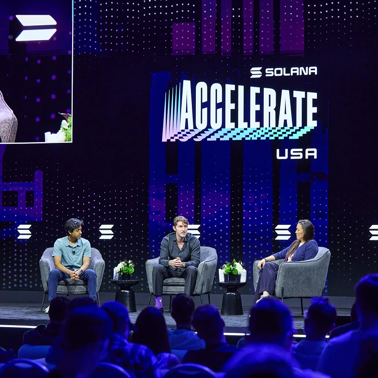
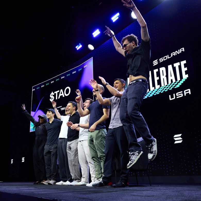
One year after its Manhattan debut, Accelerate stopped being a single American event and became a global one. Hong Kong hosted the APAC leg alongside Consensus in February 2026, and Miami took over as the U.S. stage in May, both running under the same Accelerate name to a noticeably larger, more institutional crowd.
Solana brought us back to rebuild the identity for its second lap. We kept the system's core DNA and rebuilt its foundation, moving the visual language out of a single country's colors and into Solana's own, so Accelerate could travel from city to city and still read as one continuous brand.
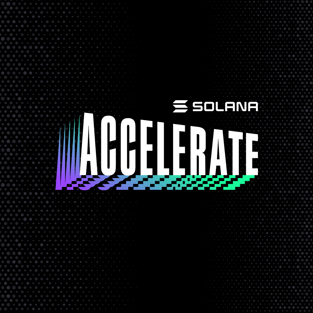
The task this time wasn't to design a new logo, it was to earn back the old one's energy in a different key. We kept the Accelerate wordmark's structure and motion but rebuilt its palette from the ground up, swapping the flag's red and blue for Solana's own gradient, so the logo reads as Solana first and location second.
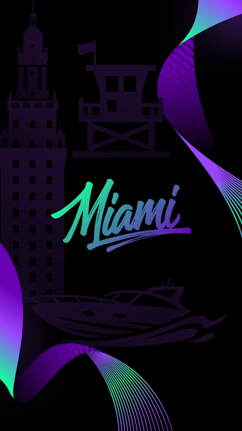
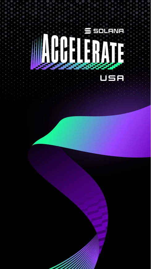
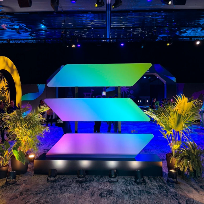
Where the original identity was a tribute to the American flag, the refreshed one is a tribute to Solana itself: purple bleeding into teal and green, a single ribbon of gradient replacing a field of stars and stripes. The result feels less like a flag and more like a signal, unmistakably Solana wherever it lands.

Every key visual now runs on the same gradient ribbon, built as a flexible system rather than a fixed set of assets, so it can stretch across a hero banner one day and a social tile the next without losing its shape.
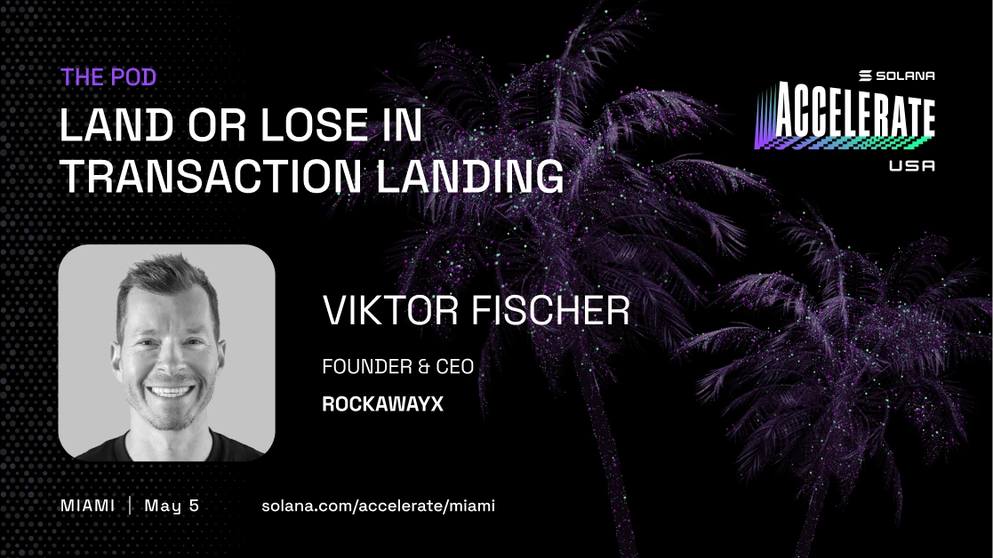
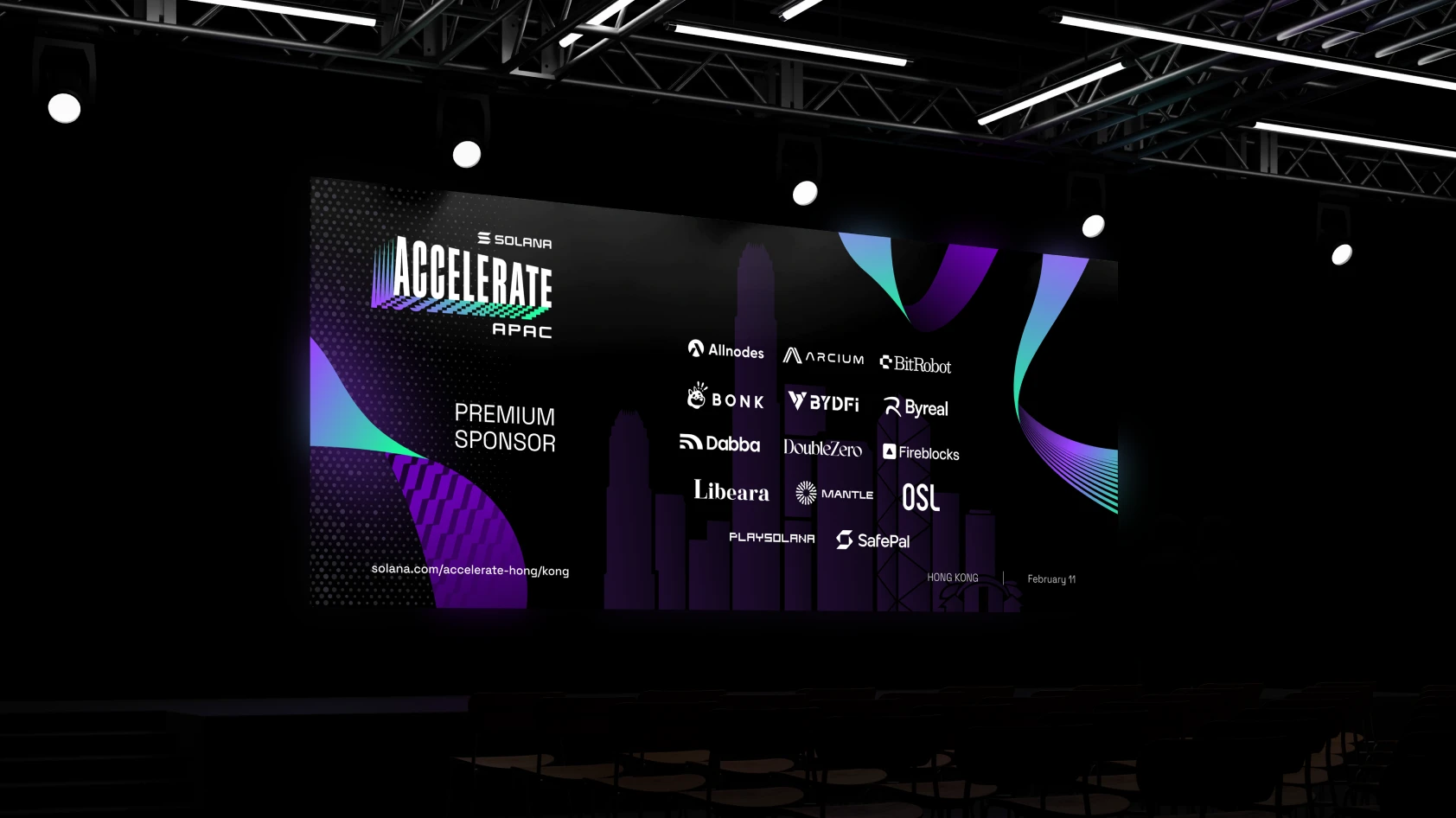
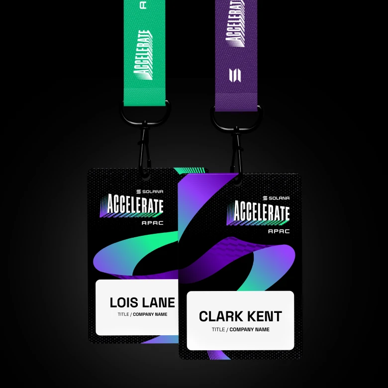
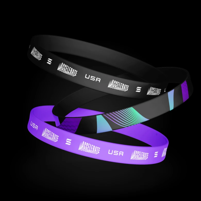
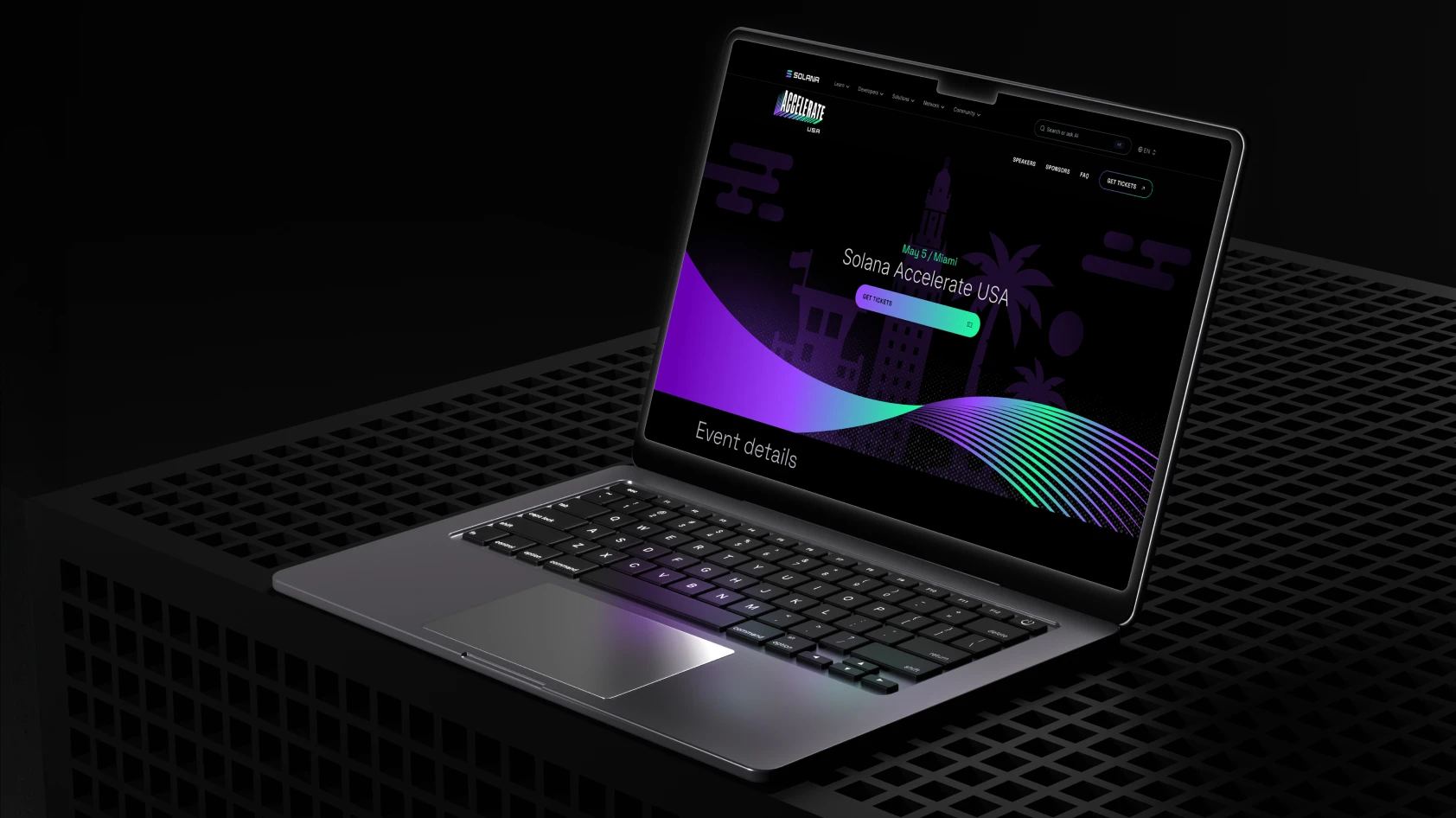
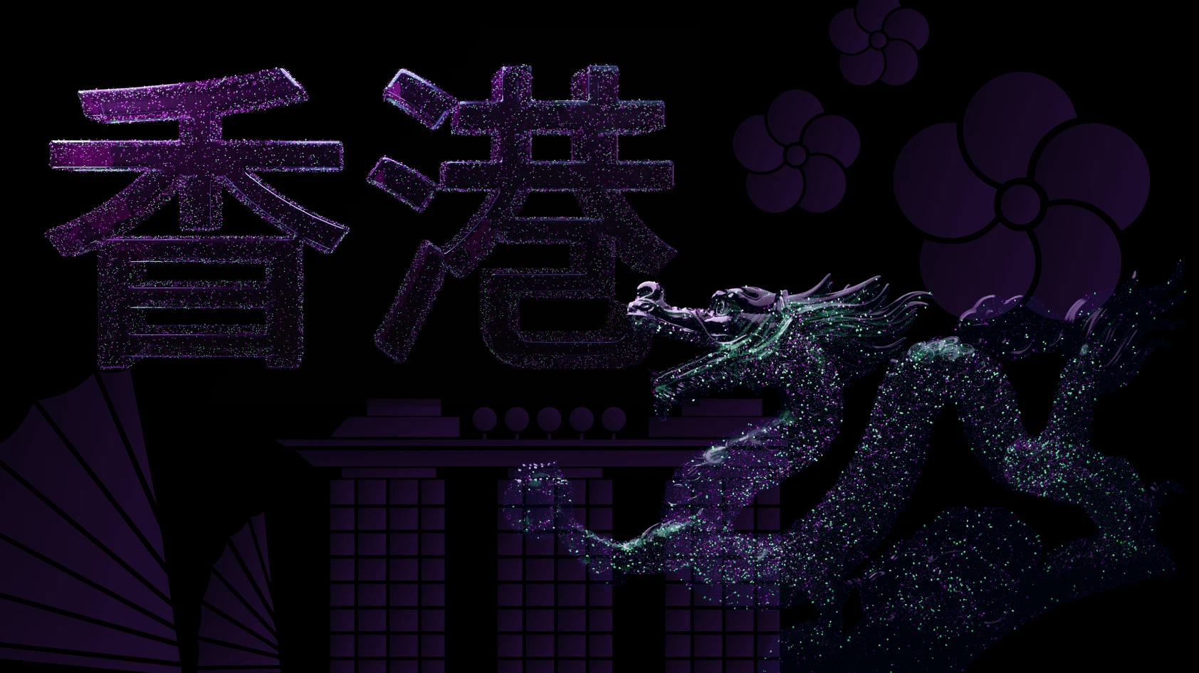
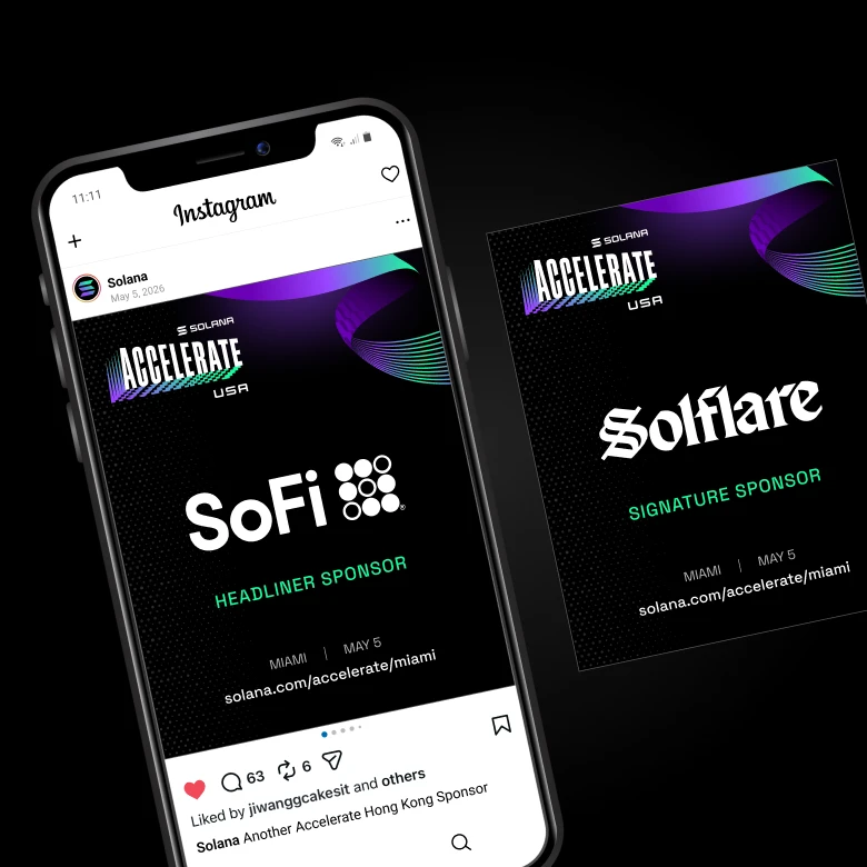
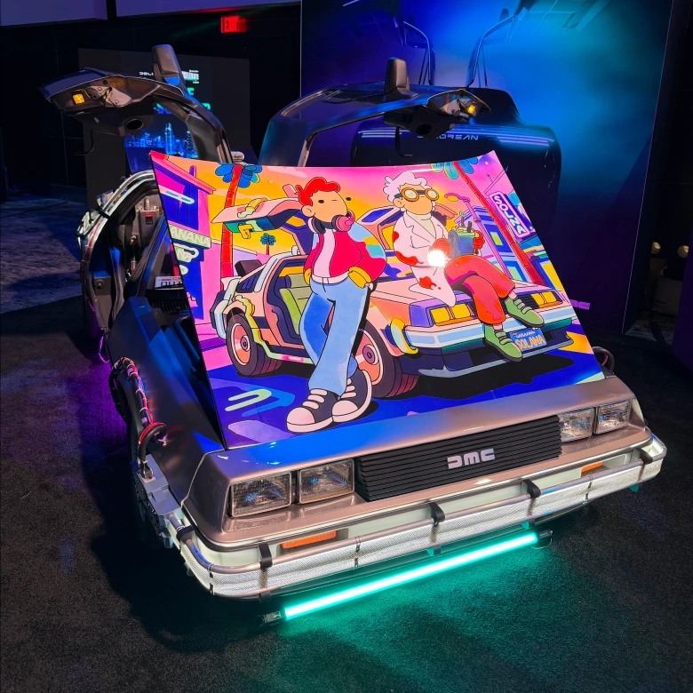
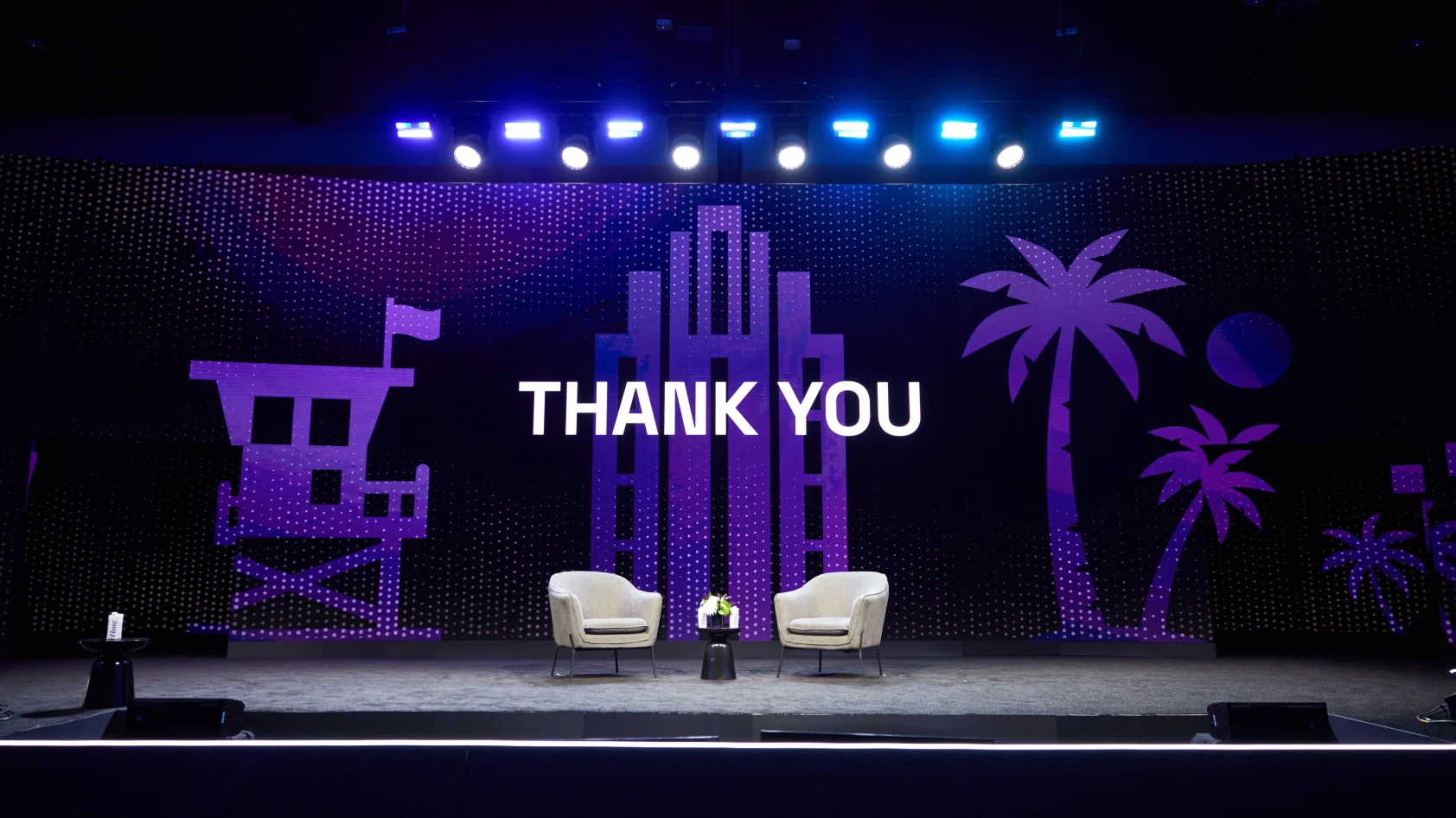
America didn't disappear, it just moved to the background. A Miami skyline and a set of American landmarks, the Capitol, the Golden Gate Bridge, Lady Liberty, a bison, the Gateway Arch, a cactus, now sit as quiet texture behind the identity instead of carrying it.
SOUND

